PANTRY KIOSK
A Project for DSGN 100
Assignment: Design a kiosk that solves a problem on UC San Diego campus.
For my DSGN 100 class, a team of 3 (including myself) was challenged to design and build a small kiosk that would efficiently, effectively, and engagingly solve a campus problem. The details of the project, that is to say, what exactly the kiosk did, how it looked, where one might find it, etc… were completely up to us. As long as it effectively solved a problem.
As three hungry university students who found themselves frequently visiting the campus food pantry, we decided that our project would identify flaws in said visits, and come up with a solution that could be implemented via kiosk.
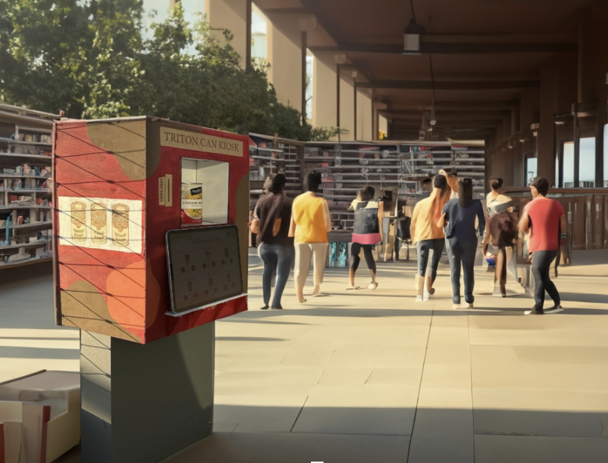
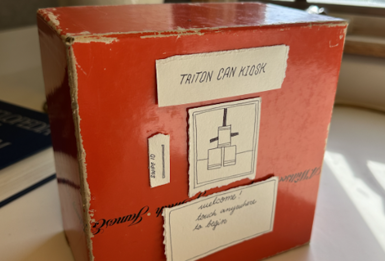
Sneak peak of the final deliverable
Once we agreed upon the vague issue our kiosk intended to tackle, it was time to get specific with justifying why it was needed, how it would function, and who it would affect.
-
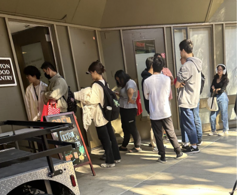
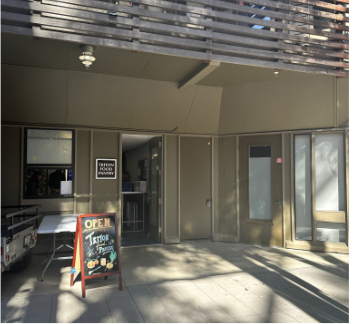
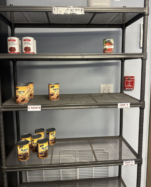
Issue: The UCSD Triton Food Pantry is an invaluable resource for many UCSD students, but inconsistent hours and secluded location make it significantly less accessible. Students don’t always know when the pantry is open, and those from further corners of campus are unable to realistically use the service. Additionally, students are also only allocated 20 points to purchase items to last them a week. The point system is confusing and rationale behind “pricing” is obscured from students.
Proposed Solution: By creating a kiosk that provides canned food at any time in a variety of locations, UCSD students will have the food security that the food pantry provides without the scheduling confusion or location isolation. The kiosk will be located in Price Center (center of campus) and each of the 8 colleges so students in every college can utilize it. It will also be available 24 hours a day so cans can be checked out at any time of day as long as supplies last.
-
Our online research was split into two primary categories, big picture and campus specific. The former gave us insight to what food insecurity looked like across different campuses, states, and countries. The latter gave us a shred of authority in critiquing the existing design system(s) of the campus food pantry by understanding how it was dealing with food insecurity in the first place.
Key Takeaways from our research indicated the following;
University students are among the most susceptible to food insecurity due to high tuition, housing, supplies, inexperience, and job competition
Many student don’t admit or accept resources for help in an effort to be self-reliant or because they don’t feel that they “qualify.”
The UC San Diego food pantry does not address the obvious pitfalls of their service— limited hours, staff, and supplies— therefore not setting a reliable bar in the services they provide.
-
Name: Oliver Putnam
Background: Junior at UCSD pursuing a degree in data science. Lives on campus, and primarily ventures out for class, meals, and chess club.
Goals: Motivated by his older siblings who set a high academic bar in undergrad. Aims to maintan his 3.5 GPA.
Challenges: Limited time, limited transportation, limited funding.
Field Research
In our field research, we took note of everything that stood out from a user design perspective. From an individuals initial interest in using the Triton Food Pantry to them walking away with a bag of groceries, we wanted to document the process and communicate our experiences with one other.

Key Interview Takeaways
To better understand the pitfalls of the Triton Kiosk, we interviewed a dozen or so visitors. While they waited in line for the products, we asked a variety of questions about why they come, what they like, and most importantly, what they don’t like. We typed the transcripts and analyzed their answers to prepare for the physical design. Below are some of the key takeaways from the interviews.
“ I think the hours are confusing. And I feel like the point system could be more clear. Sometimes I grab stuff and I don’t know the “price” of it. I don’t know if I’m severe undertaking or severe overtaking.” Derek, Senior
“…And I think location could be better. It’s a little too small and there’s always long lines.” Ashley, Freshman
“Yeah, I feel like if I was in another college I wouldn’t have known about it. So, just like, being here.” Natalie, Freshman
“…Umm, I think just the inconsistency of food. Sometimes you’ll come and it’ll be empty–other times there will be all this stuff. You just don’t know when that’s going to be.” Gilbert, Freshman
Mission Statement
We aim to combat food insecurity for UCSD students by providing more cost-effective and accessible resources to obtain food.
Physical Setup Process
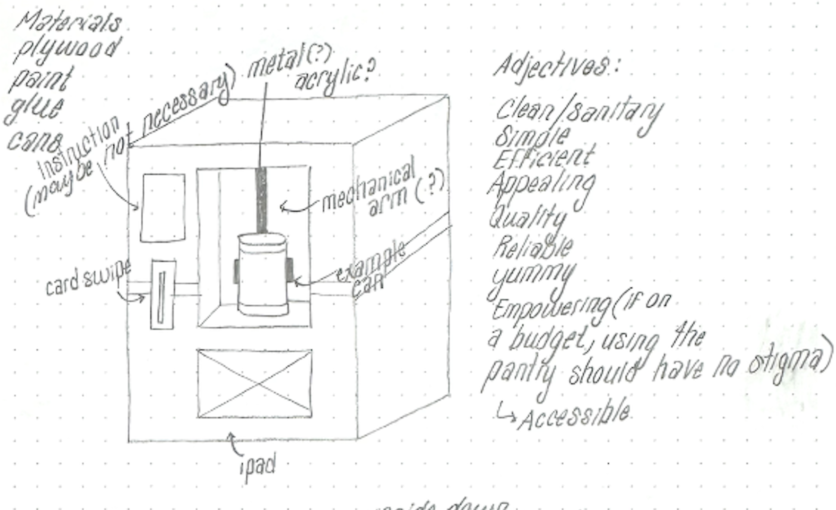
1
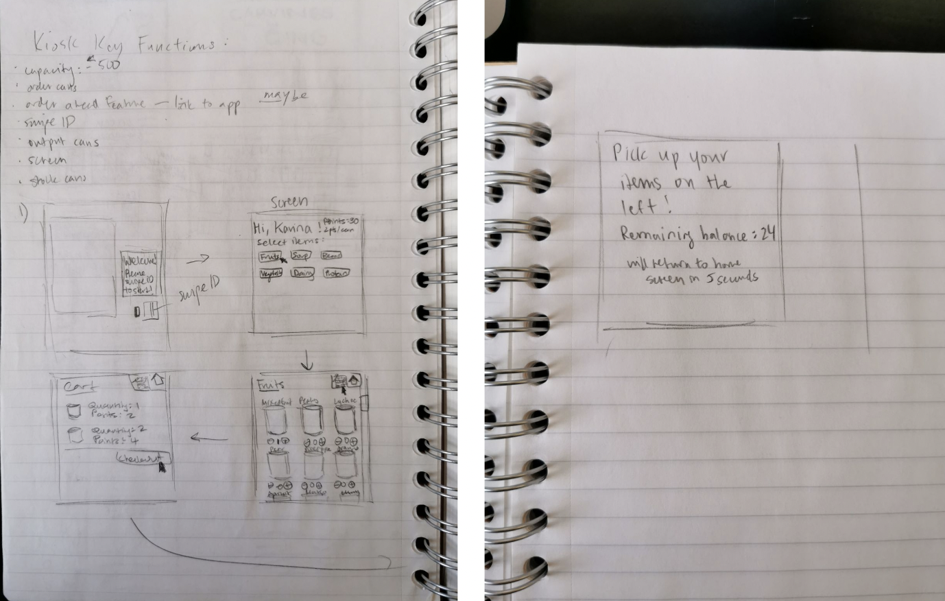
Initial sketch of the physical kiosk form. Inspired by the covid-testing vending machines on campus, we wanted a system that would fulfill the needs of the food pantry with the efficiency and ease of a vending machine. To monitor point system, students would need a place to scan their ID’s.
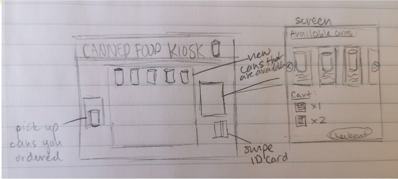
2
Still a rough starting point in terms of sketch fidelity, although a few more key details added for scale and usage. We iterated on screen placement and can visibility. This sketch explores the possibility of having two can-dispensing mechanisms to decrease the time a student would have to wait in line.
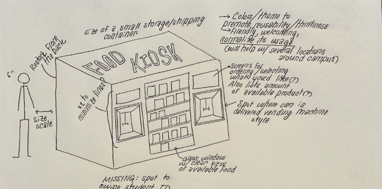
3
Here we imagined a realistic approach to how we might go about building a smaller-scale version of the kiosk for class. Also began thinking of moods and color schemes we wanted our kiosk to exude. It’s physical shape, screen placement, materials, etc…
4
Snapshot of the paper prototype resembling our most popular sketch. The paper prototype had adjustable features that let us quickly get a sense of different layouts. By re-sticking the post-it notes in various places we were able to get a sense of whether the elements should be in line or stacked, (and in which order.)
5
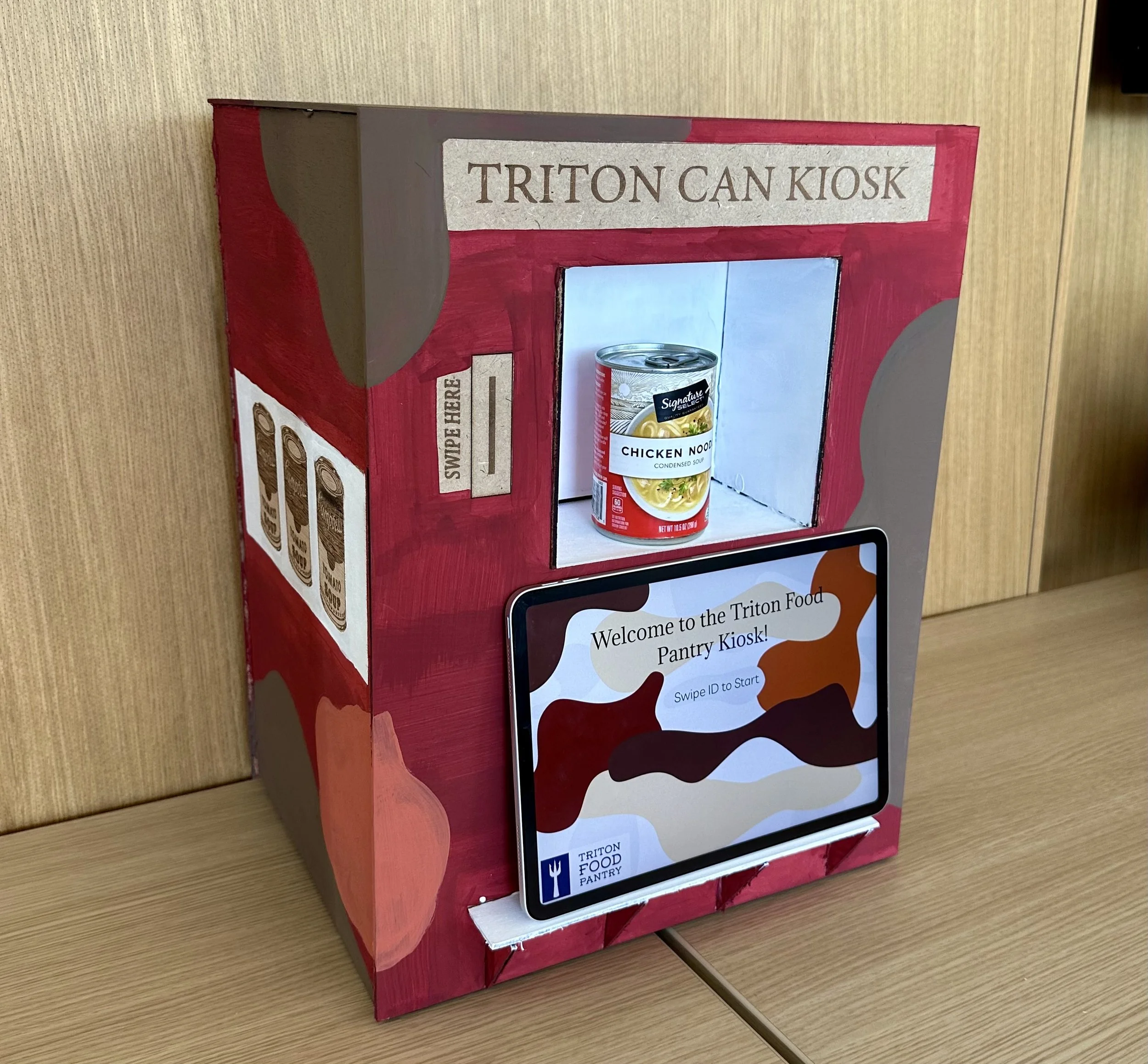
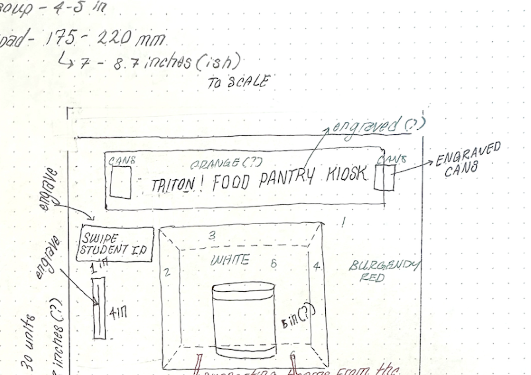
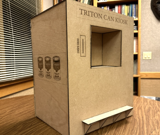
Final sketch measuring out exact dimensions of the kiosk before mocking up digitally. While we could have built it bigger to more accurately depict the “final deliverable,” we decided that as long as the key details were represented (ID swipe, can pickup, screen,) the physical size of the box would be negligible.
6
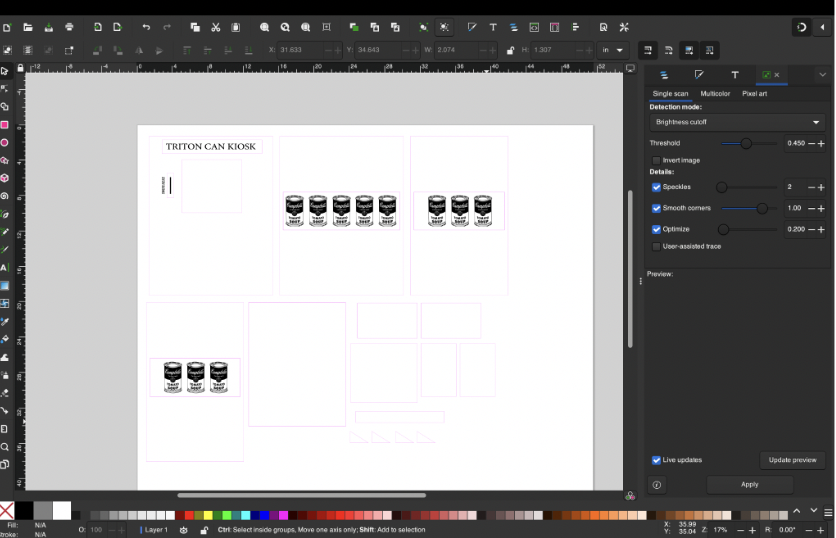
Screenshot of what the digital planning looked like in Inkscape. Several pieces were accounted for to build the final kiosk in a sturdy manner. Details in black were engraved, while lines in pink were cut.
7
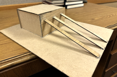
Process pictures of assembly. The box “poking” in on the inside would need to bear the weight of a can or two, so extra wooden slats were added.
8
Process pictures after assembly, before color/patterns reflecting our moodboard were added.
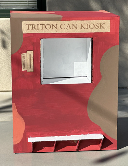
9
Final Painted Kiosk!
Digital Setup Process
Access the full clickable Figma prototype here
Before touching the computer, we sketched basic wireframes of our desired flow. From welcome screen to check out we brainstormed the “paths of least resistance” that would help students get what they needed to easily and efficiently.
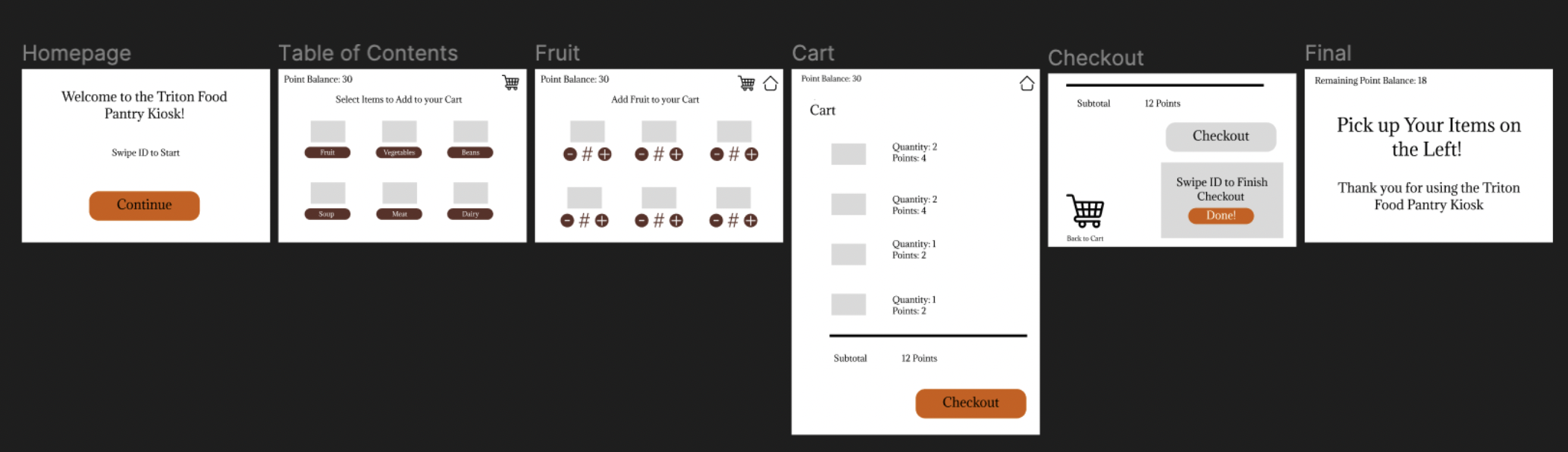
Quick screenshot of the basic Figma mock up prototype. Full access to the final clickable prototype is linked above.
User Experience Documentation
We conducted 3 recorded user tests during the kiosk showcase, all of whom are UCSD seniors in our class. They have also all used the Triton Food Pantry before.
We had these users scan a form which gave instructions on how to complete the exact tasks in order. This was meant to test different functionalities and the flow of our user interface. Functionalities included:
Find where to swipe ID
Increment quantities of cans
Identify which items are under each category of produce, protein, and soup
Navigate between screens (fruit → home, home → protein, …, home → cart)
Find where to get the cans you ordered
User Insights and Recommendations
The main issue we noticed was that all users had trouble with figuring out how to go back to the home screen to select more cans (i.e. how to navigate from fruit to protein). They didn’t realize that it was supposed to be done by clicking the home screen icon. All users took off one point in ease of use of the user interface.
Some other user testing recommendations:
Switch the placement of the kiosk screen and the can dispenser
“Might want to switch can and iPad”
“Would have iPad up and have dispenser on the bottom”
Add descriptions for categories
“Add descriptions don’t know beans are protein”
The screen could be more angled
Our Response:
We would switch the placements and slightly tilt the screen in our kiosk. We would continue to user test different implementations of categories. For example, removing categories altogether and having all the cans listed on one page (this would also remove the navigation problem mentioned on the previous slide), or adding high-level descriptions for each category.